Your landing page is the first thing your visitors interact with, and it should be so compelling that it grabs their attention at FIRST. Therefore, the major landing page mistakes that you think won’t be noticed by the users become a nightmare for you and a roadblock for ROI.
Most common landing page mistakes are design or copy related that prevents the visitors from converting into the potential paying customers. They mostly don’t sign up for the service, and indeed unclear CTAs are one of the biggest roadblockers.
So, if you think your landing page is not impacting your visitors to bounce back or stay on the web then you are wrong here….
You are stepping away from better conversion and indeed losing a lot of important opportunities. In this blog, we are going to pen down the best and most trending landing page mistakes that kill the conversion.
Are you excited to explore it with us? Let’s get started then…
What is a Landing Page?
A landing page is a standalone web page that differs from all the service pages. It is focused on one goal that is, convert the visitors through lead magnets. Unlike homepage or other pages, it eliminates the element of distraction and guides the visitors to the completion of action.
However, there are certain landing page mistakes that kill the audacity of the users to complete that one specific task leading to conversions.
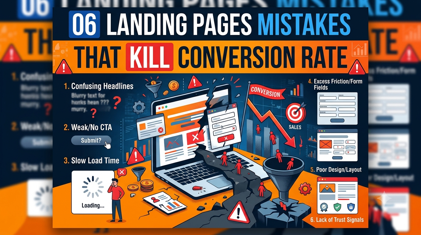
In this blog, we are going to explore those 06 landing page mistakes that one should know before driving any conclusion for low sales or conversions.
Most Common Landing Page Mistakes
Here are the most common landing page mistakes that you should know:
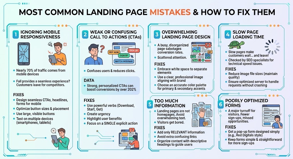
- Ignoring the Mobile Responsiveness of the Pages:
Nearly 70% of the traffic is coming from mobile devices. Thus, it concludes that most of the audience are accessing the landing pages through their mobile phones.
If you fail to provide a seamless mobile experience to the customers then definitely they will leave the page and proceed with someone else – your competitors. This is not something that we are saying but it’s based on facts and research.
Key Fixtures – how to fix mobile responsiveness issues
Here are the key fixtures to deal with common landing page mistakes:
You can design the call to actions, headlines and forms to work seamlessly on mobile phones or all platforms.
Optimize the button sizes and placement of it.
Use buttons that be higher in size and can be seen by the users (hence hard to be ignored)
Test them with different devices and check the landing page on the smartphones or tablets to spot the issues and make the decision.
- Weak or Confusing Call to Actions (CTAs):
Users are now becoming more concerned about the CTAs and if the messaging on it fails to captivate them then, whoop! You have missed an opportunity.
For example, if you are asking a visitor to buy a product from your store and sign up for a newsletter and watch a webinar – all of this together then the users will get confused and won’t click on any of the pop-ups. Instead they would ignore it.
On the other hand, strong, personalized CTAs can boost conversions by over 202% compared to standard CTAs (HubSpot).
Fix common landing page mistakes of CTAs placement
You may use powerful bets like, download, start or get to grab the attention of the users and give them a clear message.
Create a sense of urgency.
highlight what the users can get by clicking on the forms or pressing the buttons.
Focus on the single or an explicit action for avoiding the overwhelming user’s response.
- Overwhelming Design of the Landing Page:
A very busy or disorganized landing page is one of the biggest mistakes that you can make and it will ultimately sabotage your conversion rate. Whenever a visitor will encounter a mix of text or a visual element, the attention will go scattered and the experience would become frustrating. Therefore, to get rid of these issues you should:
Fix common landing page mistakes of overwhelming designs:
Embrace the white space and utilise it to seperate the elements to gain the visitor’s attention.
Using a clear and professional image that aligns well with the brand’s to engage the visitors.
Choosing an accurate color for secondary and primary share to attract the audience.
- Slow Page Loading Time:
A slow loading landing page makes the customer wait a lot at the website and eventually they go to someone else because they can’t wait for 5 minutes…
Most of the SEO specialists look for these issues while performing technical SEO to ensure the page is working perfectly fine and there ain’t any speed issues.
Therefore, the common ways to fix landing page mistakes related to speed include:
Reducing the image file size for decreasing the load times without sacrificing the visual quality.
Ensure that the server is optimised to handle the bulk of requests at once without being crashed.
- Too Much Of Information:
Sometimes telling a lot to the visitors can be dangerous. You need to differentiate between a landing page and homepage. You will now showcase all of your information on the landing page that might make the entire experience overwhelming for the readers.
You know if you prefer to overwhelm the visitors with lengthy text then, they will get bored really quick.
Therefore to manage these issues, you should:
Avoiding Adding Too Much Information on Landing Page:
Only add relevant information on the pages.
Avoiding adding extra links that confuses the audience.
Organize content under descriptive headings to guide the users throughout the pages.
- Poorly Optimized Forms on Website:
Lastly, we have the optimization concern for the landing pages and indeed it’s another most common landing page mistake that we have seen so far…
If the contact forms on the website are poorly designed then it becomes a major turnoff for the visitors. When asked to fill out the forms that seem complicated then, they mostly back off due to the fields that are not clear to them.
This entire process creates a sense of frustration in the customers and leads to fewer sign-ups and missed opportunities.
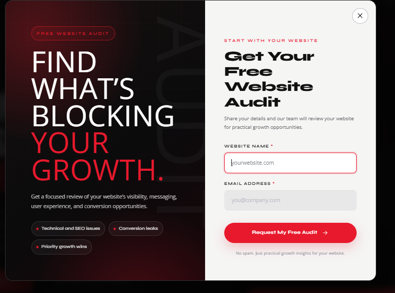
The best way out is to get a pop-up form designed like Red Digitals, and let the users fill it up without any complications. The simpler it is, the more sign-ups you will get.
Key Takeaway | Common Landing Page Mistakes
And we are done for the day. Now you would have learnt the importance of landing pages and how powerful they are for converting the visitors. However, simple layouts, compelling captions and messaging encourages the users to fill it up more and be a part of the revenue stream.
Continual improvements are necessary for making the customer’s digital experience amazing and we assume that you have learnt a lot about the common landing page mistakes through this blog.
FAQs
- What is a landing page and how is it different from service pages?
A landing page is a standalone page that is created with one specific action whereas a homepage is designed for messaging different services to the visitors at a time.
- How many CTAs should a landing page have?
A landing page should have one primary goal and typically feature a single, repeated call to action (CTA) pointing to that same action.
- What are the most common landing page mistakes that kill the conversion rate?
The most common landing page mistakes include, using a vague or confusing headline that fails to explain your value within five seconds.